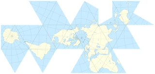
The Dymaxion map or Fuller map is a projection of a world map onto the surface of an icosahedron, which can be unfolded and flattened to two dimensions. The flat map is heavily interrupted in order to preserve shapes and sizes.
You can really see how close all the world is to being a single contiguous landmass. I was first exposed to this map from a random page in a Wired magazine that actually was just using the map to convey some data and did not actually explain what the map was or how it was created.
Map of the world in a Fuller projection with Tissot's Indicatrix of deformation
Example of use illustrating early human migrations according to mitochondrial population genetics (numbers are millennia before present)
There are two more examples from Wikipedia. The human migration aspect is important, the creator of the map used it in a book he authored:
Showing the continents as "one island earth" also helped Fuller explain, in his book Critical Path, the journeys of early seafaring people, who were in effect using prevailing winds to circumnavigate this world island.
Here are some other interesting facts about this map... all of my quotes are from Wikipedia:
Fuller claimed that his map had several advantages over other projections for world maps.
It has less distortion of relative size of areas, most notably when compared to the Mercator projection; and less distortion of shapes of areas, notably when compared to the Gall–Peters projection. Other compromise projections attempt a similar trade-off.
More unusually, the Dymaxion map does not have any "right way up". Fuller argued that in the universe there is no "up" and "down", or "north" and "south": only "in" and "out".[4] Gravitational forces of the stars and planets created "in", meaning "towards the gravitational center", and "out", meaning "away from the gravitational center". He attributed the north-up-superior/south-down-inferior presentation of most other world maps to cultural bias.
Fuller intended the map to be unfolded in different ways to emphasize different aspects of the world.[5] Peeling the triangular faces of the icosahedron apart in one way results in an icosahedral net that shows an almost contiguous land mass comprising all of Earth's continents – not groups of continents divided by oceans. Peeling the solid apart in a different way presents a view of the world dominated by connected oceans surrounded by land.
All off this information should hopefully convert you to a believer of this map and maybe even a user of it, next time you have to consider which projection of the world to select for an image or to illustrate various data metrics. Personally, I am a huge fan of this map, even before I was aware of all the advantages it offers. It just makes sense! If you have to view the world in two-dimensions, then this is the map to do it with.


No comments:
Post a Comment